|
|
Post by DnDPaladin on Apr 7, 2015 20:59:35 GMT
man dont forget pigeon pete !
nice work on the turtles.
awesome work on the baxter.
|
|
|
|
Post by voduchyld on Apr 13, 2015 22:27:00 GMT
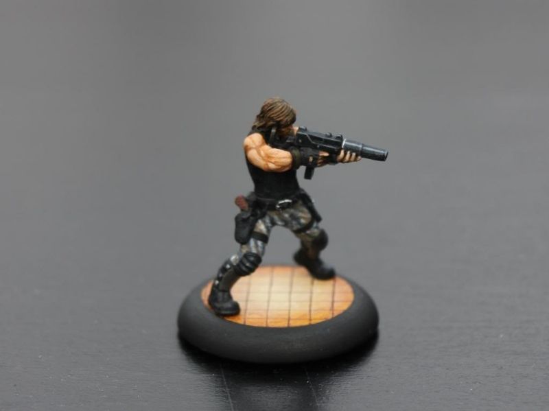
i got only one thing that irks me... that rocksteady... great job on the changes to make him look good. its the colors that irks me... i thnk hes way too dark. Ever since i first saw that comment, i couldn't find anything to say other than: "That's true!" I tried a couple of reshots under different illumination (day, night, light, no light, bulb, fluorescent...) to finally come to the conclusion that what was wrong was the color scheme i used. It broke my heart to acknowledge this because it was the Rocksteady i grew up with, the action figure i had as a kid. Nonetheless, i had to do something... and then i found this picture on the net.  Loved the artwork, so i decided to go with a similar color scheme with a lighter colored tank top.   I think this version makes a better tribute to the character. He looks a bit more like the version we saw in the 80's cartoon (even though he had a yellow tank top and khaki pants). I'm way more satisfied about this paint job than i was of the first one. For the goggles on the helmet, i glued on some tiny beads and filled them up epoxy putty. I painted the lens as i would have with gems, topped with gloss acrylic varnish to make them reflective as glass would be. I'm now working on both Bebop and Rocksteady's human form. I want them to be a part of the Purple Dragons, that are going to have a big part in the beginning of my campaign. I'll be posting pics of them as soon as i'm done with them.  |
|
|
|
Post by DnDPaladin on Apr 14, 2015 6:24:06 GMT
This, This... seriously This, sucks badly man !!!
Totally joking, these colors fits much more, i'm still irking a bit, thinking it has to do with the black lines still in the crevices.
Nah, im nitpicking at that point... seriously this is much better, me likey ! 8)
|
|
|
|
Post by michka on Apr 14, 2015 7:37:47 GMT
I liked the original paint job, but you have kicked it up to eleven here. Fantastic! The heavy black line work keeps the comic book/cartoon feel, which I assume you are looking for. The goggles give the head better definition too. It's a big improvement on a damn fine figure.
|
|
|
|
Post by voduchyld on Apr 14, 2015 19:31:31 GMT
DnDPaladin the black line are intentional, like michka said their purpose is to give it a comic book style. If you look closely at my other figures on this thread, they are all painted the same way (with black lining), even the turtles. Still, thank you for the compliment michka, from someone with such great sculpting and painting skills, your kind words go right to my heart. Thank you very much! You're right, i'm trying really hard to give these figures a heavy comic style. The only thing i want to learn now is how to paint those non-metallic metals, because i've tried a couple of times and it wasn't successful.
|
|
|
|
Post by DnDPaladin on Apr 14, 2015 19:56:05 GMT
I tryed one way with my chests to do metallic without having metallic colors. it was hard to do. but i ended up simple light grey with varnish over it and it looked metal enough for me. mind you the varnish was thinnned a bit too. so maybe you could try that.
as i said, nitpicking... im a perfectionnist that can never achieve perfection. as i said, this figure for me is good enough for play. if it gets to that stage then it is pretty good a result.
|
|
|
|
Post by michka on Apr 15, 2015 6:02:26 GMT
There are a couple ways to do Non-Metallic Metal effect that I know of. One is to do a series of grays, medium base paint, dark gray for shadow, and light gray for the highlight. Then make the thinnest line of white you can make along the keen edge of the metal, but only along one edge. Be diligent about where you put the white line, and keep the dark gray at the opposite side of the white edge. I know there are tutorials out there on the net if you look for them. Here is an old example of what I'm talking about. Check out Snake's gun. I didn't use the white line on these, because the equipment is supposed to be black.
The other method may be a better choice for the comic book look, and that's Kirby squiggles. Look at any Jack Kirby drawing that features a metal object. (For instance, Captain America's shield) he draws these amazing, cool parallel thin curves on the surface of the metal that indicate were the light side is. Then on the opposite side he makes much thicker curves that almost mirror the thin curves used for the highlight. I'm sure this isn't making any sense, but take a look at some Kirby drawings and see what I mean. It's also worth noting that Eastman and Laird were HUGE fans of Kirby, and it shows when they did their first outer space adventure.
And now I will stop droning on. |
|
|
|
Post by voduchyld on Apr 16, 2015 12:33:58 GMT
I officially started experimenting on non-metallic metal yesterday, i'll be doing the turtles weapon in that manner. So far, Leo's ninja-to looks good and i'll be doing Raph's sais today after school. The real challenge will be doing Mikey's nunchaku chains, but i'll try figuring it out. i'll post pictures when i'm done |
|
|
|
Post by voduchyld on Apr 17, 2015 0:33:01 GMT
So Leo's finished! I'm quite satisfied with my first attempt at non metallic metal.  It looks way better in person, the transition from black to white is smoother but it's not bad. I began Raph's sais but only had time giving it the base color, i'll finish them tomorrow. |
|
|
|
Post by DnDPaladin on Apr 17, 2015 7:39:57 GMT
i'd say its a great start.
the white really pops it out too.
its like the small white dot some adds to their eyes to make the reflection.
itsa really great way to make it happen.
great start indeed man !
|
|
|
|
Post by michka on Apr 17, 2015 7:47:48 GMT
That looks pretty damn good. I'm really impressed with the transition colors in the blade. Alternating the dark to light on the edge with the light to dark of the body is a great technique. One that I never seem to get right.
I have one recommendation, if it's not too presumptuous. Ignore me if I'm being a pain. For next time is to put the white highlight on only one side. Obviously you'd want to go with the front, since it's the sharp edge. A line of white along the front edge and the front bevel, along with one at the top will sell the glint of light effect.
|
|
|
|
Post by voduchyld on Apr 17, 2015 12:59:42 GMT
thanks guys! |
|


 Cheers!
 Cheers!