|
|
Post by NonCharon on Jan 8, 2014 4:29:09 GMT
I got a pathfinder "red dragon" bones mini for Christmas. I've seen it in red, orange, and blue. I decided to try it in green. I'm fairly pleased but I need to get better at highlights and shadows. The base is flocked with static grass, dried coffee grounds, and tea leaves. i would have have done light box photos but I was tired when I was done and took him to sit on my desk at work the next morning. :-) 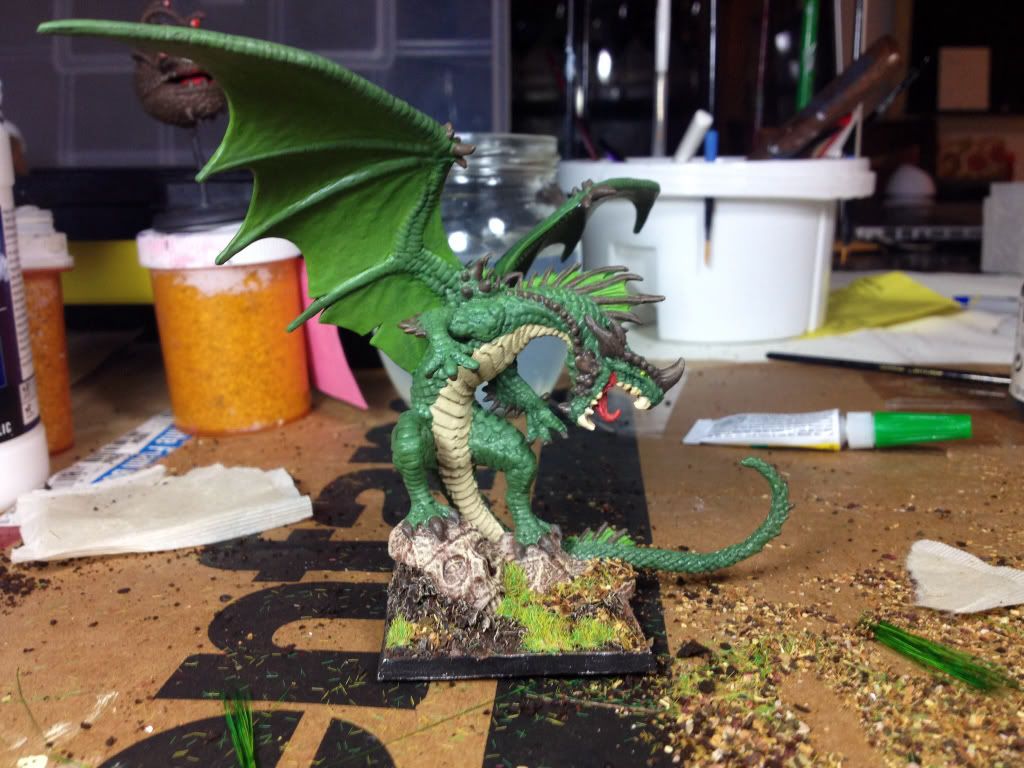 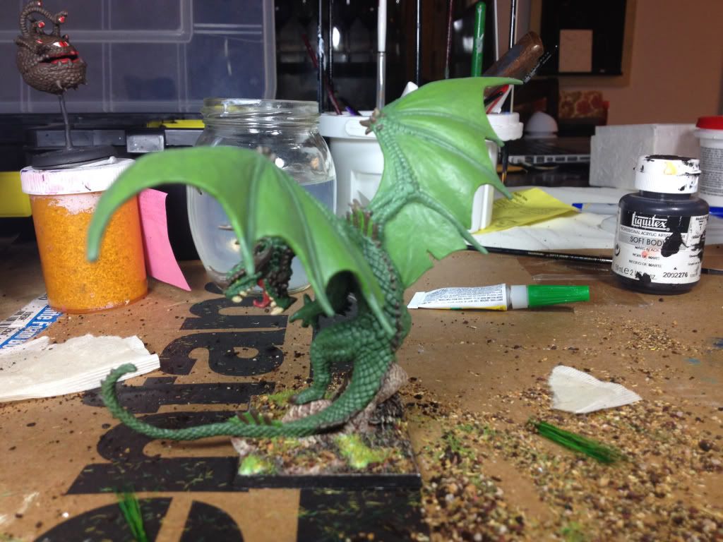 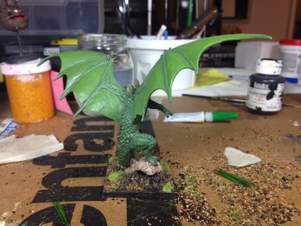 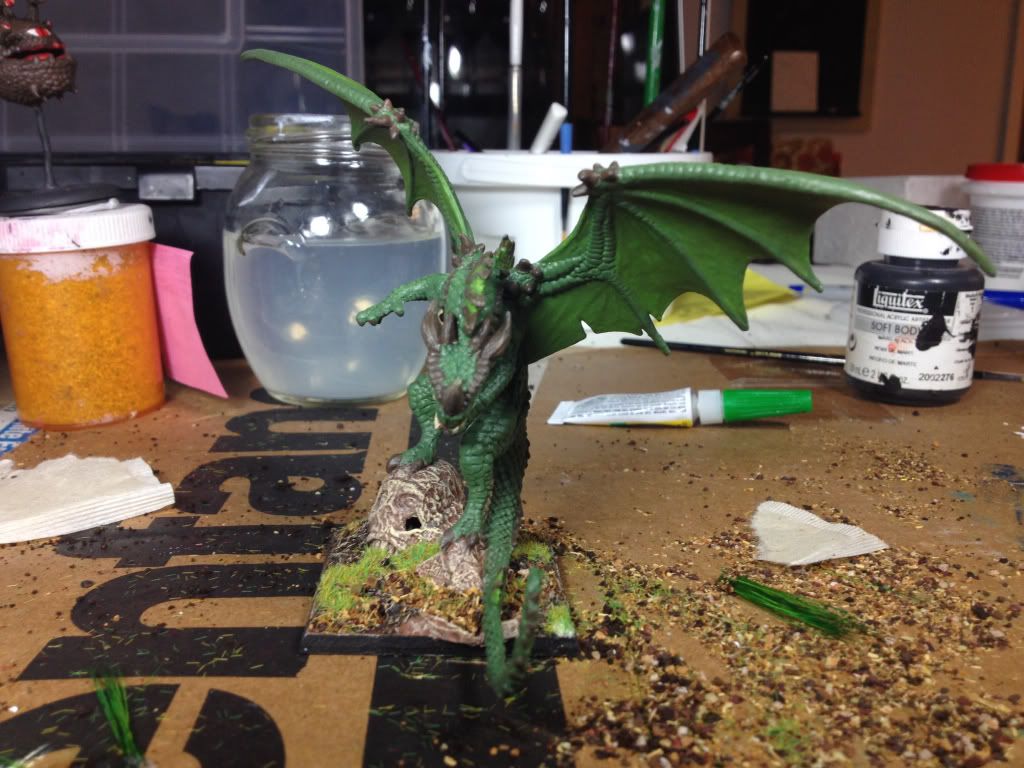 |
|
|
|
Post by monkeywithtacos on Jan 8, 2014 6:12:23 GMT
Nice! If you haven't already, brush it with a black "wash".... Reaper sells one, as does many others... I personally prefer Games Workshop "Nuln Oil", out of the various ones I have used... Love the base work...
|
|
|
|
Post by onethatwas on Jan 8, 2014 7:53:53 GMT
While not an official wash, you can also dilute black or dark gray with water, brush it over the mini, then either air dry or soak up excess water with a paper towel. The more you dilute, the less black effect you get.
|
|
farfade
Cardboard Collector

Posts: 32 
|
Post by farfade on Jan 8, 2014 8:23:50 GMT
beautiful dragon !
|
|
|
|
Post by grym247 on Jan 8, 2014 8:25:25 GMT
looking pretty sweet dude
|
|
|
|
Post by NonCharon on Jan 8, 2014 20:47:29 GMT
I washed the horns/spines with dilute reaper walnut brown, and the scales and wings were washed with a mix of green, blue, and black. I wanted something that wouldn't contrast too much with the green. I need to get better at highlights and shadows. It's just that when I get a good base coat I don't want to screw it up. I need to practice on some minis I don't care that much about.  |
|
valas
Room Planner
 I'm being twisted, on the sideway down.
Posts: 459
|
Post by valas on Jan 8, 2014 21:21:32 GMT
Highlighting does take practice, but looks very well when done right. Start with the darkest color of your scheme to establish your shadows. This is typically your base coat. Then start layering with progressively brighter colors. The first color over the base coat cover 3/4 of the model leaving the basecoat in the creases and where you want your shadows. You continue bringing the color up with lighter shade, each shade covering less of the model than the prior coat. The final shade being the brightest only where the light source would strike. There are lots of videos out there on how to layer and highlight.
|
|
|
|
Post by sgtslag on Jan 9, 2014 15:59:49 GMT
The washes you have already used, worked well, but they are a bit on the light side. Still, your painting skills are above mine by a long shot. I just block paint, and use The Dip/Magic Wash. I agree, a darker wash would help by darkening the recesses, but I would experiment on other figures, to learn how to achieve the results *you* want, before tackling it on this piece of art... This dragon is really great work, but it could be elevated even higher, with the proper dark wash. Thanks for sharing the eye candy! Cheers!
|
|
|
|
Post by adamantinedragon on Jan 9, 2014 16:31:23 GMT
First, let me say that I love the dragon, and am highly impressed with the skills demonstrated. I'd love to be able to paint that well.
My comments to follow are more about style and taste than skill. Just because I've started looking at my own painting a little differently after perusing a lot of miniatures on some mini painting websites.
What I am looking for in my own miniatures now is less of a "realism" and more of a "contrasty" approach. The idea I'm pursuing now is that what I want is for the miniatures to pop and grab attention more than that I'm trying to make them look like tiny versions of a "real creature." (As silly as that sounds when talking about dragons and elves...)
Anyway, that means that a "green dragon" will be green overall, but specific parts of the dragon that I want to really draw the eye might be yellow or red or even blue. For example, the back spines, the claws and even things like the wing ribs I would contrast strongly with the general greenness, even if only by using a much lighter or darker green. The same, or similar, to what you did for the belly. Things like scar tissue I would also make stand out visually so that the effort the sculptor went through to make the dragon appear to have been through combat were rewarded with visual cues. Where you have the lighter green on the webbing between the back spines, I might have gone with a yellow or red.
But as I said, that's all stylistic. I love what you've done with this, and I'm not being critical, I'm just pointing out that there are (at least) two different approaches to miniature painting, and yours seems more of the "realistic" style which is what I used to always do, but the more visually compelling style is starting to appeal more to me, and as I paint that way, I get a much more positive response from my players than my old style.
|
|
|
|
Post by skunkape on Jan 14, 2014 18:32:38 GMT
Great looking paint/base job on the dragon
|
|
neil
Paint Manipulator
Posts: 134
|
My minis.
Jan 14, 2014 19:05:43 GMT
via mobile
Post by neil on Jan 14, 2014 19:05:43 GMT
Well done
|
|
Bael
Room Planner
Posts: 288
|
Post by Bael on Jan 23, 2014 18:06:52 GMT
A beholder back there as well.
|
|


 Cheers!
 Cheers!