|
|
Post by sgtslag on May 12, 2021 20:49:30 GMT
I bought several 1-inch hex grid sheets, from The Armory, back in the late 1980's with the idea of putting together a d20 globe of my game world, using the pattern found in Dragon Magazine issue 48, pages 28-29, "Getting a world into shape," by Karl Horak. Image of the article.I drew up my world map on one of the sheets, then I employed some tricks I learned in my Middle School industrial arts -- printing class: if you use cellophane tape to hold artwork (letters, photo's, etc.) onto a master copy sheet, the tape, and the edges, will not show up in a photocopy (or on a printing plate made with a Process Camera). I printed out labels for land masses, oceans and seas, and even the Equator, and the Tropic of Humanis (northern hemisphere) and the Tropic of Draconis (southern hemisphere). I made these labels using a word processor, printed them out on white paper, then I cut them out, and I mounted them on my camera art copy, using Scotch Tape. I ran the camera art copy through a large format photocopier (these are available at office supply companies, such as Office Max, and similar places). I made several copies, so I would not need to come back if I ran into problems in the process. I colored one copy with pencils: the water, the land masses, etc. It was a t-e-d-i-o-u-s process... Back then, when I did this (early 1990's), all I had access to was a B&W large format copier. Modern large format copiers can enlarge/reduce, and they are capable of color! I attempted to mount 1mm thick cardboard on the backs of the triangles, to provide support. I further covered the front surface (colored pencils) with clear Con-Tact Paper ( translucent vinyl cupboard shelf liner, Wal-Mart), which would protect it from water, and it would allow me to use water-based pens to mark it, if necessary. The vinyl covering made it durable, but it also made it difficult to handle. The 1mm thick cardboard was nowhere near strong enough. I successfully stapled some of the tabs together, to form it into a d20, as a test, but then I realized it would never hold together, properly. Image of my first, failed, attempt.Fast forward to today. I hatched a new plan to cut up triangles out of MDF, to glue to the back, inside the d20. I need a Chop/Miter Saw to make these accurately, and I hope to pick one up, within the next two weeks. I will cut strips of MDF on my Table Saw, mark them for the triangular cuts needed, then make those with the Chop Saw. The old map is pretty hashed. I will take one of the copies of it, and experiment with water color paints to color it: much faster than coloring with pencils, will give better texture to the map, and it will have more vibrant colors. I will take the colored copy to the local office supply store, to make new, color copies (will be flat, unlike the dried, painted original), and then I will proceed with one of these for the next step. I will cover it with clear Contact Paper again, then I will use an X-bead of PVA/Wood Glue to attach the MDF triangles to the inside of the form, pressing them with some books, until they dry. I will then Hot Glue the triangles together along the edges: much faster, easier, and less mess, than using PVA/Wood Glue. When fully assembled, I will have a d20 globe of my fantasy world. It is really to inspire me, the DM, as opposed to inspiring my players. They have only visited two continents of my world [all campaigns have been placed in Cegia (size of Continental USA); there have been a few toe-dips into Sauria (Eur-Asia sized continent)], in the past 30+ years. I do not expect them to visit any of the other regions, but who knows. If they voice an interest, I will need to come up with the cultures for those regions... Woo-Hoo!!! I will post updates as the project progresses. Cheers! |
|
|
|
Post by erho on May 14, 2021 14:53:46 GMT
Interesting to be sure, this is one I'll watch with great interest!
|
|
|
|
Post by sgtslag on May 14, 2021 15:05:31 GMT
If the colored copy, shown in the photo above, were not so hashed, I would make color copies of that, to work with. There is one spot, on a seam, which is torn away, leaving only clear vinyl. That, and the roughness of the whole, prevent me from running it through a color, large format, photocopier. If it ran through, without jamming, it would likely come out with creases, which would hide sections, as well as deform the copy such that it could not line up properly.
My only option is to color one of the old copies, then make color copies of that to work with. I will likely need to press it, after applying watercolor paints, to get it to dry flat, without distortion. If that fails, I will need to re-think it. I might be forced to go the pencil route again (Ick!). We shall see. If the watercolor paint fails, I may try pastels, instead of pencils -- faster, easier, I hope... It will likely take me all Summer to finish it. Cheers!
|
|
|
|
Post by margaret on May 14, 2021 17:39:31 GMT
If the colored copy, shown in the photo above, were not so hashed, I would make color copies of that, to work with. There is one spot, on a seam, which is torn away, leaving only clear vinyl. That, and the roughness of the whole, prevent me from running it through a color, large format, photocopier. If it ran through, without jamming, it would likely come out with creases, which would hide sections, as well as deform the copy such that it could not line up properly. My only option is to color one of the old copies, then make color copies of that to work with. I will likely need to press it, after applying watercolor paints, to get it to dry flat, without distortion. If that fails, I will need to re-think it. I might be forced to go the pencil route again (Ick!). We shall see. If the watercolor paint fails, I may try pastels, instead of pencils -- faster, easier, I hope... It will likely take me all Summer to finish it. Cheers! Winsor and Newton makes a range of drawing inks. You might look into those. Years ago, I used them along with watercolors to do illuminating. I think you might get less buckling of the paper, although I may be remembering wrong. And I wasn't doing large swathes of color, anyway. The inks can give you an intense color in a thin layer, although you can thin them to a lighter color if you prefer - I wanted the intense color, so I usually used them straight. These inks are still available, individually or in sets.
The colors are transparent and can be overlaid or intermixed. They can be applied with a brush, as easily as watercolor.
|
|
|
|
Post by sgtslag on May 14, 2021 19:18:55 GMT
Ever tried using rubbing alcohol with watercolor paints? Just thought of it. Might evaporate fast enough, that it would not damage/wrinkle the paper as much?... " Experimentation is king, Baby!"  Time to experiment, I think... Cheers! |
|
|
|
Post by erho on May 14, 2021 21:10:10 GMT
This may be going out of the way compared to your ideas, but if you were to take one triangle at a time and scan them all, arranging them in the foldable pattern in your favorite software, you could then take it to kinkos or similar to print out on a big plotter?
|
|
|
|
Post by skunkape on May 17, 2021 12:45:10 GMT
Looking forward to seeing what comes of your world mapping project. I saw that article when it first came out and remember using that kind of map template when I was running Traveller. Some very interesting ideas you have for making your world.
|
|
|
|
Post by sgtslag on May 22, 2021 3:13:38 GMT
Bought some school watercolor paints at Wal-Mart, tonight. First tried experimenting on a corner cut-off of one of my map copies. Soon realized I needed to experiment on a copy of the map. Ran off a copy of one of the large island groups on my map, to try some real techniques, on real images I need to paint. Here are some samples of what I achieved: - Original photocopy, colored with pencils, covered with clear Contact-Paper.
- Watercolor painted photocopy of a section of the final map.
- Left: color photocopy of watercolor painted map; Right: original watercolor painted copy.
- Watercolor set of school paints, from Wal-Mart. Used the included brush -- why not?
Thoughts, comments, input? I did discover that if I am careful, I can control where the watercolors go. I also discovered that I need to be very careful wielding the brush, as well as managing the water content of the brush! Furthermore, I discovered that I need to do something with the lettering of the oceans, and likely the land masses, as well: the watercolor tends to wipe them out! More experimentation is necessary. I am thinking that if I ran over them with colored pencils, it might keep the watercolor paint from covering them up? Gotta try -- only way to know. I could also outline them with a different, lighter color, to protect them -- would work more for the oceans, would not work for the land masses. Hmmm... Cheers! |
|
|
|
Post by skunkape on May 23, 2021 3:20:58 GMT
I've found Sharpie markers in multiple color packs. I wonder how well that would work with the watercolors painted over them, that is if you wanted to use more than just black. My only thoughts about copying is it looks like the colors shifted, or is that just the photo? Also, have you tried using foam brushes? Not sure if you're worried about brush strokes or not. Foam ones should apply the paint a little more uniform.
While the colored pencils are probably easier to deal with, the watercolors look a lot more striking and vibrant. I'd stick with the watercolors, they look better to me.
|
|
|
|
Post by margaret on May 24, 2021 1:04:05 GMT
I think it's very hard to get transparent color in a consistent intensity from those kid's watercolor blocks. Part of the reason that I suggested the drawing inks is that they ARE transparent, so your printed labels would show through. But with watercolors, I think you would be better off with even the cheapest tube watercolors than with blocks made for kids. I had those for my kids when they were little, so I do have some experience with their limitations.
|
|
|
|
Post by sgtslag on May 24, 2021 20:40:47 GMT
margaret , you had me with your first post on the inks! I am going to visit Michael's, tonight, to look for them. They sound idiot-proof (aka, Sgt. Slag-proof)! I love water-color paintings, by professionals. They are incredibly difficult to control, but when done properly, they are superb, IMO. I wish more artists worked within that medium. I plan to use some white pencil to outline the land masses, and maybe the place names (continents, and oceans/seas), to create a highlight around them. On the DragonsFoot forum post I created, a member posted an image of a map of the US East Coast (I think...), which demonstrates the effect I hope to achieve. 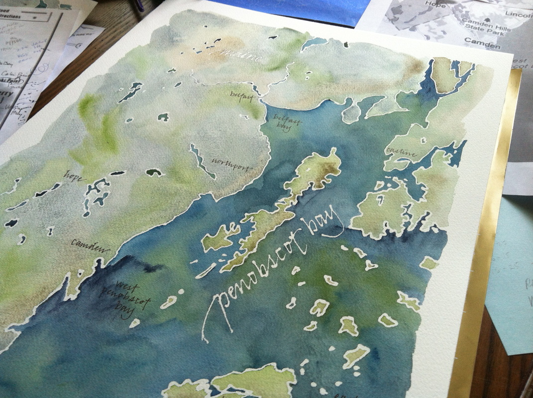 I hope to be able to achieve color variations, within the vast oceans of my map, to create depth indications. The color variations, above, are somewhat similar to what I hope to achieve. Experimentation will tell me, Yay, or Nay... My studies have informed me that 90% of ocean life exists on the continental shelves, surrounding the continental land mass borders, above water. I hope to reflect that in my map. I read some novels about Mermaids and such, a few years ago. The author touched on this concept, referring to the waters beyond the continental shelf as, The Abyss. I would so love to run an undersea campaign... Even if I never do, it will be fun to sketch out some ideas on the world map which touch on the realms beneath the waves. My idea is that players would run aquatic race characters: Sea Elf Thieves, Triton Priests, Mermen Fighters, Mages, and Bards... Like I said, this map is really to inspire me, the DM, far more than to inspire my players. Thank you, All, for your feedback. It is tremendously appreciated! Cheers!
|
|
|
|
Post by erho on May 25, 2021 21:28:52 GMT
Well damn that is killer!
Underwater quests are fun, but different. Lightning bolt is a area of effect weapon for starters, centered on your character.
|
|
|
|
Post by sgtslag on May 26, 2021 3:47:01 GMT
As My Stomach Churns... Episode #23: So I bought some watercolor Inks: transparent Daler Rowney Aquafine Inks, Leaf Green, Cadmium Yellow, and Phthalo Blue. Gorgeous colors, fun to play with. The Phthalo Blue is uber-dark. I will need to experiment with diluting it with water, to see if I can lower the pigment density -- a lot! Ink Bottles
I played with applying them, using my $0.04 School Paint Brushes, 30 in a pack. I was genuinely surprised how easy it was to control the application of the ink! I really could color within the lines, with minimal effort! I experimented, and I learned that the Leaf Green, overlaid with Phthalo Blue, gives a nice turquoise green color, which I like for demarking the Continental Shelf regions, around the land masses. Land Mass Image #1I experimented with overlaying the Cadmium Yellow and the Leaf Green, on the land masses, for grasslands, and mountains. I think I will avoid overlaying them, one atop the other. The Phthalo Blue is very strong in coverage, even though these are transparent inks! I think I will experiment next using a white colored pencil, to fill in, and around, the Ocean and Land Names, hoping that the water-based inks will not penetrate, leaving a white aura surrounding the names, allowing them to clearly stand out. Land Mass Image #2
Tune in next time, same craft channel, same craft time, for more of... As My Stomach Churns! [Sponsored by your favorite anti-acid supplier -- tablets not included.]
|
|
|
|
Post by sgtslag on Jun 16, 2021 22:08:45 GMT
Finally tried using white colored pencil over the letters, then I applied the ink, full strength: photo link. It is better, but the ink is still very strong, and it is still mostly covering the pencil coating. I logged into the Daler-Rowney site, to check out their range of Aquafine acrylic inks. I found a better blue color that I like (Coeruleum Hue), but it is listed as opaque! The Phthalo Blue I am using, is listed as transparent, and it mostly covers the underlying toner imagery... I expect that the opaque Coeruleum Hue would completely hide the underlying black toner imagery... Time to experiment with watering down the Phthalo Blue ink, to see if I can lighten it up. Also, time to search YouTube for information on these acrylic inks, and how to vary their pigmentation levels to decrease their overpowering coverage. I really was hoping the waxy colored pencil coating would repel the water-based ink. Only a tiny amount of joy in that prospect. Cheers! |
|
|
|
Post by erho on Jun 17, 2021 21:56:56 GMT
|
|
|
|
Post by sgtslag on Jun 18, 2021 14:06:50 GMT
Interesting suggestions. I fear that the white hydrophobic pen would cover the lettering. The white pencil lightened it up, without erasing it.
The airbrush idea is intriguing, but the only airbrush I have is a simple Testors unit, only suitable for painting large areas, like terrain pieces. That might actually work, though. It likely would reduce the warping and wrinkling of the paper, as the amount of water being delivered would be very small, compared to applying it with a heavily loaded brush.
I will see if I can locate my Testors airbrush, and its propellant can, and give it a try, this weekend. Thanks for the suggestions! Cheers!
|
|


 Time to experiment, I think...


 Cheers!